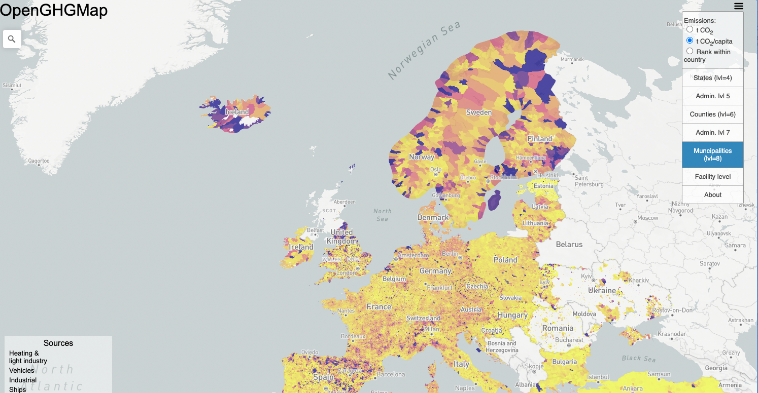
Map shows carbon dioxide emissions for more than 100,000 European cities
Cutting greenhouse gas emissions to meet climate goals won’t be easy, to put it mildly. But the job just got a little simpler for 34 European countries with the creation of a new interactive map that pinpoints emissions at a local level.
When world leaders and negotiators meet in Glasgow later this month, one of their main goals will be to set greenhouse gas emissions targets for each country.
The reality is, however, that the world’s cities and towns will actually have to implement many of the changes that result from these targets. But before they can make any cuts authorities need to know where the emission hot spots in their municipalities are now.
There’s no time to sit around and discuss this anymore.
Enter https://openghgmap.net, an interactive openly available map that shows carbon dioxide emissions at different municipal levels, such as by city or county, for 34 European countries.
“The European Commission has been clear that cities will play a central role in reaching European climate goals. A greenhouse gas (GHG) inventory is the first step to preparing a local climate action plan,” said Daniel Moran, a senior researcher at the Norwegian University of Science and Technology’s Industrial Ecology Programme, and the first author of a new paper describing the interactive map.
- You might also like: Blocking the sun to control global warming
From long-term planning to individual building permits
A detailed inventory at a local level allows city and town officials to make informed decisions — whether it’s in developing long-term planning strategies and infrastructure investments or in day-to-day decisions about building permits, Moran said.
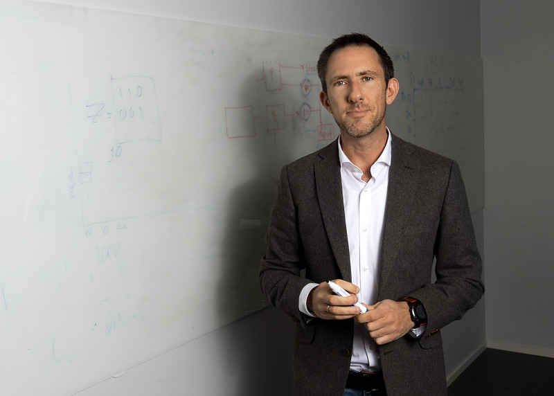
Daniel Moran. Photo: Titt Melhuus
Moran and his colleagues built their interactive map based on the national reported emissions for 34 European countries. The data are from 2018. They then used nine different methods to apportion those emissions to 116,572 municipal and local governments.
The emissions information is reported by each country using something called a CRF, or Common Reporting Framework. That allows emissions to be categorized according to where they come from — whether from shipping to air traffic to refineries and more. All told the CRF contains 167 highly detailed emission types.
Fuel use offers an example of the level of detail the researchers were able to use. The CRF has five separate categories of fuel use, including for cars, light trucks, heavy trucks and busses and so on.
The researchers also used the numbers reported to the EU’s Emissions Trading System, which requires large CO2 emitters— like a coal-fired power plant — to report their emissions, as well as where those emissions come from.
In fact, it was the emissions from a trash-to-energy power plant that gave Moran the inspiration for the project.
“I was looking out the window and wondering what zero-carbon would look like in Trondheim,” Moran said. “I immediately thought of the Heimdal (trash-to-energy) incinerator, but I wondered what else would change? So I got curious to think about what decarbonization will look like in each city.”
- You might also like: The Longship that could help save the planet
Big emissions from Oslo? Well, not quite.
Some of the decisions the researchers made caused some surprising results. For example, you’d think that Oslo, the capital of Norway and the country’s largest city, would be the top CO2 emitter.
Nope.
That honour goes to Stavanger, the south-western coastal city that is the registered location for many of the offshore petroleum production facilities that are legally registered to offices in the city, Moran said.
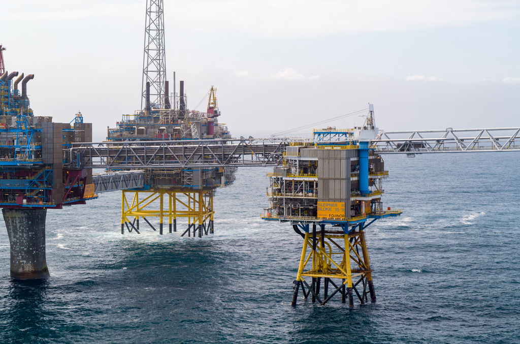
Equinor’s Sleipner field, on the Norwegian Continental Shelf. The OpenGHGMap locates the CO2 emissions from installations like oil platforms at the company’s registered administrative offices. That decision has made Stavanger, the “oil capital of Norway”, a hotspot on the map. Photo: Øyvind Gravås and Bo B. Randulff. Copyright: Equinor
While the size of Stavanger’s CO2 emissions underscores the outsized impact Norway’s petroleum industry has on the country itself, it also illustrates a second problem the researchers had to solve.
Where do you locate emissions that don’t necessarily have a specific physical location to which the researchers could like?
Offshore oil platforms at least can be linked to the corporate offices that are responsible for their existence, Moran and his colleagues reasoned.
But what do you do with a passenger ferry? Or air travel?
Should the emissions follow a track along the flight path of the plane, or the course of the ferry from one ferry dock to the next? That would have added a level of complexity that perhaps wouldn’t have helped make the actual emissions issue clearer.
So instead the researchers decided to use aviation bunker fuel use at the country’s different airports, pro-rated by 2018 passenger volume. Moran says this is one of the limitations of their model, because cargo flights, long-haul flights and military aviation might be located at airports different from those handling the most passenger traffic.
A tool for the European Green Deal
In July 2021, all 27 EU Member States signed on to making the EU the first climate neutral continent by 2050. One step towards this goal is a pledge to reduce emissions by at least 55 per cent by 2030 as compared to 1990 levels.
Tools like this website could become useful for the EU in detecting its large emission sources.
Helene Muri, one of the paper’s co-authors, said the website could be helpful for member states who want to make good on their pledges.
“Tools like this website could become useful for the EU in firstly detecting its large emission sources, and secondly determine where action could be taken in order to work towards some of the key action items of the Green Deal — energy, transport, industry, climate and environment,” she said.
European countries need to be crafting policies now if they are going to have any chance of cutting emissions by 55 per cent by 2030, she said.
“There’s no time to sit around and discuss this anymore. This map should accelerate their ability towards action,” she said.
The real winners are smaller towns
Many larger towns, including Trondheim, the city where NTNU’s main campus is located, have already undertaken very specific greenhouse gas measurements and inventories, so Moran and his colleagues’ findings won’t come as a big surprise.
The real beneficiaries here, however, will be smaller towns or rural areas, where officials don’t have the resources to make accurate assessments.
“A lot of the smaller towns don’t have the bandwidth to do this,” Moran said. “Many wealthier cities and governments have prepared inventories, but much of Europe lacks any information about the scope of these emissions. That’s where the GHG map can offer the most help.”
The article is currently available as a preprint at https://essd.copernicus.org/preprints/essd-2021-299/. As of late October, the preprint, shared on Moran’s LinkedIn page, had had more than 110,000 views.